12-30-2019, 08:29 PM
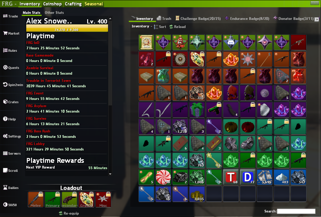
I have a few suggestions on the current inventory GUI.
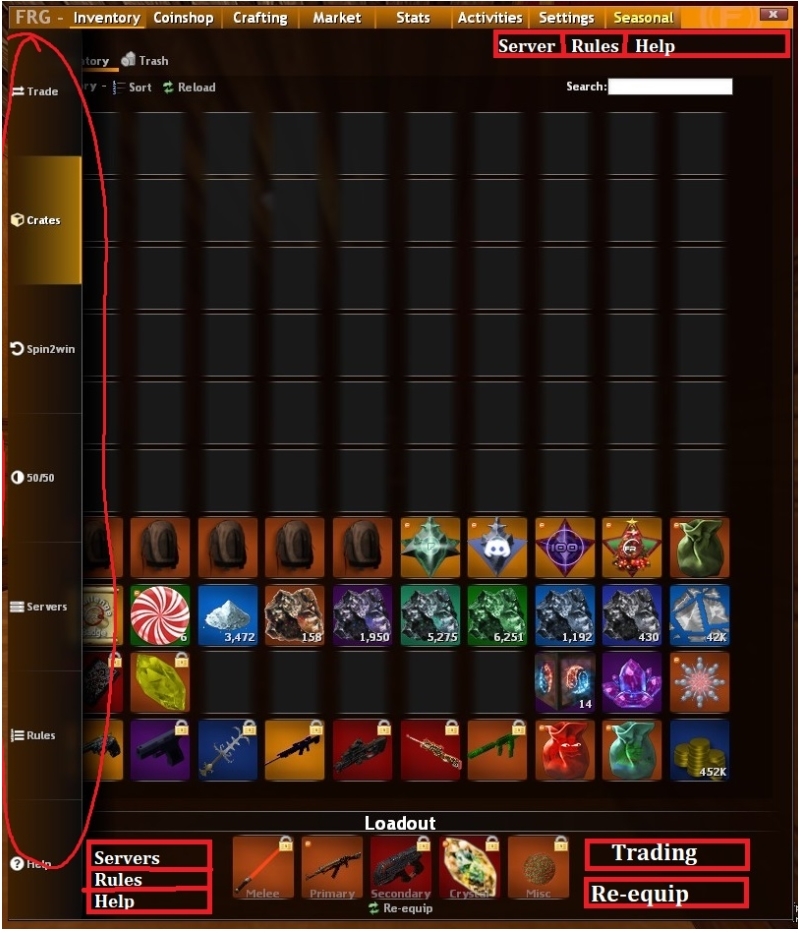
Here is a very mockup picture
1. Remove the left side bar
I feel like the side bar is kind of annoying to deal with, and makes the inventory more confusing. First, when trying to grab stuff on the far left, moving too much over will activate the animation of the side bar, covering half of the slots. I know it may seem small, but it can be annoying at times. I think removing it is the best options because most of the buttons can be placed in the top tabs of the inventory.
2. No Animation for the side bar
Instead of an animation, when you hover over it the text will fade in, telling you what it is.
3. New Trade button
If you remove the side bar where should all of those buttons go? I have a few ideas for them. The trade button should either go at the button right, kind of like NTG style GUI, or where re-equip is and put it to the side(maybe also move reequip and trading together? this might make it easier to misclick though.). You could also put it in a separate new tab, fleshed out with the trade offer suggestion from one of the other threads (of course this is more to bargain for, but it would be cool to see something like that), adding it in the market tab, or simply just removing it, as most people use !trade anyways.
4. Remove the crate button
To be honest I find myself using the crate button the least, I think it should just be removed, for the case of simplifying. When you open a crate the "crate progress" button is there, and you can also do !crate.
5. Moving Spin2Win and 50/50 into activities tab
I know Brass doesn't like the idea of a gambling tab, but I think putting it inside the activities tab is much better. It gives more use to that tab, and also maybe you can integrate 5050 into the inventory panel.
I also would like to see the !ach gui inside the activities tab also (it really needs some love tbh).
6. Moving Server, Rules and Help
The server-help buttons are very important for new comers so they should stay on the main inventory tab. I think having 3 buttons at the bottom left of the inventory, at the top of the inventoy, or keep it where it's at right now, but use my 2nd suggestion for it.
Those are what I can think of.
Here is a very mockup picture

1. Remove the left side bar
I feel like the side bar is kind of annoying to deal with, and makes the inventory more confusing. First, when trying to grab stuff on the far left, moving too much over will activate the animation of the side bar, covering half of the slots. I know it may seem small, but it can be annoying at times. I think removing it is the best options because most of the buttons can be placed in the top tabs of the inventory.
2. No Animation for the side bar
Instead of an animation, when you hover over it the text will fade in, telling you what it is.
3. New Trade button
If you remove the side bar where should all of those buttons go? I have a few ideas for them. The trade button should either go at the button right, kind of like NTG style GUI, or where re-equip is and put it to the side(maybe also move reequip and trading together? this might make it easier to misclick though.). You could also put it in a separate new tab, fleshed out with the trade offer suggestion from one of the other threads (of course this is more to bargain for, but it would be cool to see something like that), adding it in the market tab, or simply just removing it, as most people use !trade anyways.
4. Remove the crate button
To be honest I find myself using the crate button the least, I think it should just be removed, for the case of simplifying. When you open a crate the "crate progress" button is there, and you can also do !crate.
5. Moving Spin2Win and 50/50 into activities tab
I know Brass doesn't like the idea of a gambling tab, but I think putting it inside the activities tab is much better. It gives more use to that tab, and also maybe you can integrate 5050 into the inventory panel.
I also would like to see the !ach gui inside the activities tab also (it really needs some love tbh).
6. Moving Server, Rules and Help
The server-help buttons are very important for new comers so they should stay on the main inventory tab. I think having 3 buttons at the bottom left of the inventory, at the top of the inventoy, or keep it where it's at right now, but use my 2nd suggestion for it.
Those are what I can think of.


 x1
x1
 x1
x1
 x1
x1

