+- Forerunner Gaming (https://forerunnergaming.org/forums)
+-- Forum: Server Info (https://forerunnergaming.org/forums/forumdisplay.php?fid=3)
+--- Forum: Server Patchnotes (https://forerunnergaming.org/forums/forumdisplay.php?fid=4)
+--- Thread: Patchnotes 07/26/2017 (/showthread.php?tid=5841)
Pages:
1
2
RE: Patchnotes 07/26/2017 - TJ1524 - 07-26-2017
I actually like it how it is. I like small buttons to clutter the inventory less.
RE: Patchnotes 07/26/2017 - Brassx - 07-26-2017
(07-26-2017, 07:41 PM)TJ1524 Wrote: I actually like it how it is. I like small buttons to clutter the inventory less.
I think the side bar is probably a better option in the long run though. I don't plan to make this an option as that will make things more complicated coding wise.
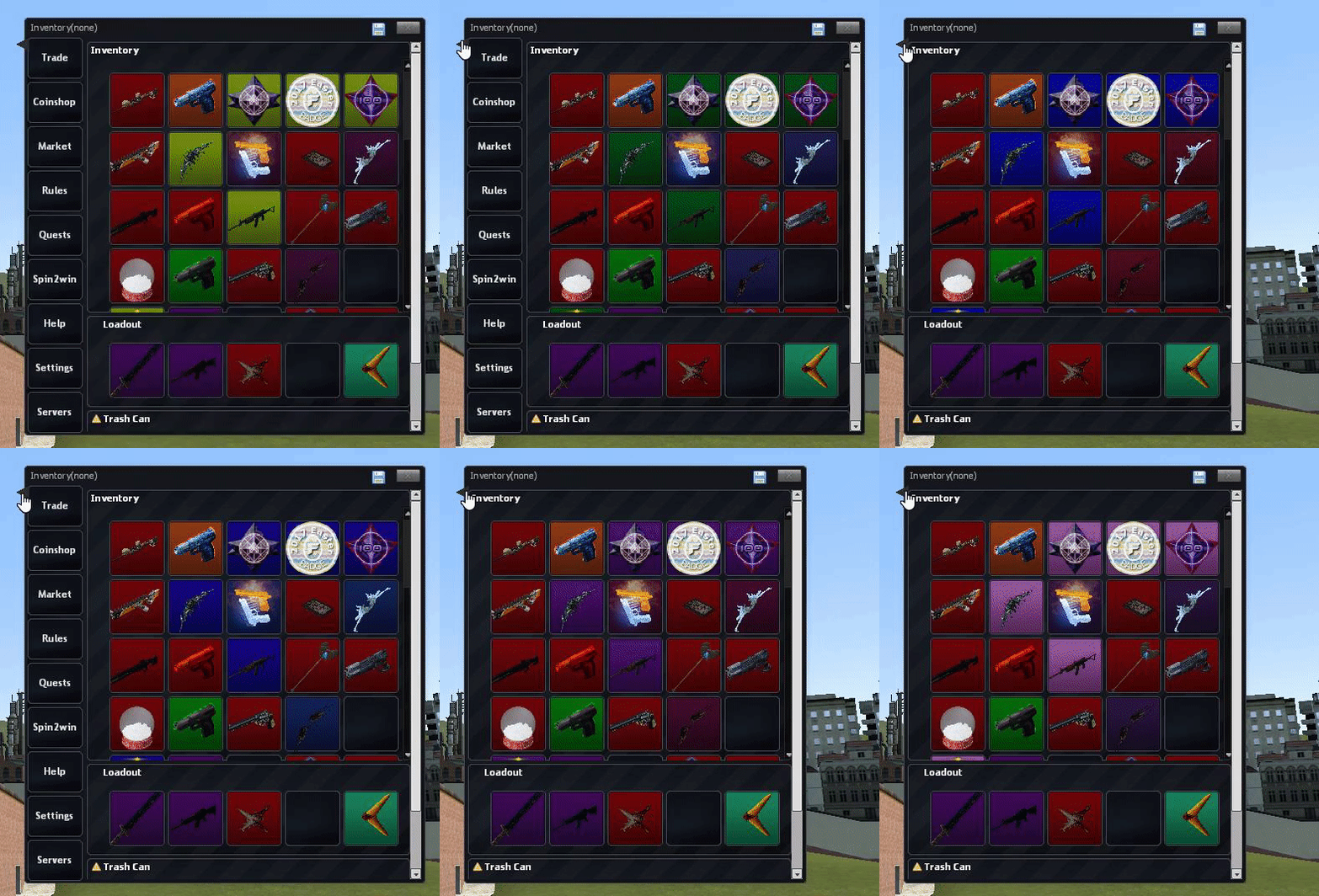
I'm just adding a new way for me to make buttons like those, with ease. Before I'd have to position/size them by hand and it was a real pain. This one doesn't overlap the Inventory in anyway, it just adds its width onto the frame, it also resizes with the frame.

But maybe I could make a way to 'show/hide' it.
RE: Patchnotes 07/26/2017 - Angry_Reaper - 07-26-2017
(07-26-2017, 07:49 PM)Brassx Wrote:what about a way to keep it as it was before? i feel kinda overwhelmed with so many buttons, i liked how simple it was before(07-26-2017, 07:41 PM)TJ1524 Wrote: I actually like it how it is. I like small buttons to clutter the inventory less.
I think the side bar is probably a better option in the long run though. I don't plan to make this an option as that will make things more complicated coding wise.
I'm just adding a new way for me to make buttons like those, with ease. Before I'd have to position/size them by hand and it was a real pain. This one doesn't overlap the Inventory in anyway, it just adds its width onto the frame, it also resizes with the frame.
But maybe I could make a way to 'show/hide' it.
RE: Patchnotes 07/26/2017 - 2bias - 07-26-2017
(07-26-2017, 08:18 PM)Angry_Reaper Wrote:(07-26-2017, 07:49 PM)Brassx Wrote:what about a way to keep it as it was before? i feel kinda overwhelmed with so many buttons, i liked how simple it was before(07-26-2017, 07:41 PM)TJ1524 Wrote: I actually like it how it is. I like small buttons to clutter the inventory less.
I think the side bar is probably a better option in the long run though. I don't plan to make this an option as that will make things more complicated coding wise.
I'm just adding a new way for me to make buttons like those, with ease. Before I'd have to position/size them by hand and it was a real pain. This one doesn't overlap the Inventory in anyway, it just adds its width onto the frame, it also resizes with the frame.
But maybe I could make a way to 'show/hide' it.
Quote:I'm just adding a new way for me to make buttons like those, with ease. Before I'd have to position/size them by hand and it was a real pain. This one doesn't overlap the Inventory in anyway, it just adds its width onto the frame, it also resizes with the frame.
RE: Patchnotes 07/26/2017 - Unpoke - 07-26-2017
I would love a way to show/hide 'em.
RE: Patchnotes 07/26/2017 - SP1D3RP1G - 07-26-2017
what about the new traits?
RE: Patchnotes 07/26/2017 - Brassx - 07-26-2017
For now it will be like this:

I'll make a better button icon for it in the future. But this should work just fine for the time being.
RE: Patchnotes 07/26/2017 - Bathory (She/They) - 07-27-2017
Contribution badge for talking about a server menu when